
maruchan
rebrand

FINAL

BRIEF


PACKAGING


LOGO

MARUCHAN
2020
Identity Rebrand
Logo
Packaging

Repositioning target market and increasing customers' trust in quality
Maruchan is an instant noodle brand well-known for its tasty and inexpensive price. It has been a common staple brand that attracted many generations, but not for the health-conscious market. Maruchan wanted to shift its target market from college students to young adults and working families.
The original packaging pays little attention to visual aesthetics and strong branding guideline. I believe this directly impacts the customer's trust in the quality.
From my observation of generic supermarket brands, I noticed that low-price products tend to have low-effort designs. I am challenging the idea that inexpensive price doesn't have to be mean poor quality or tacky design.
Keeping the market shift in mind, I tried to keep the key points in their brand identity such as tasty, quick & easy, and fun.
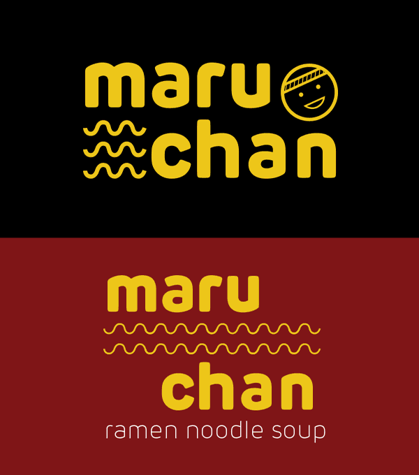
I loved the smiling icon from the original logo because it feels fun and personal, but I felt it doesn't align with the more elegant and mature theme.
I chose a thick typeface with rounded corners to still give the playful feeling. The new refined logo has wavy lines like the noodle. The lines are versatile and could be used as graphic elements or explored furthermore for different mediums.
Simple and focused design with necessary information
Students' priorities are taste and
price, but families prioritize health,
high quality, and time.
The transparent window replaces the typical product photo and instead lets the customer focuses on the quality of the food they're getting.
I chose matte material and a more muted color for an elegant feeling. The flavor is identified through color in a monochrome palette to tie the identity better. Simple line illustrations of the flavor are blown up on the background and could serve as visual interest in the plain color background.
MONICA TRIWIHARTO
